The Brief
The client requested a visual identity that feels craft, handmade, and authentic, referencing flowers or cereal plants. The green color had to echo the zellige-style tiles chosen for the bar’s counter. The logo also needed to function like a stamp.
flexible, strong, and versatile.
Client
Epicure NamurContext
Lunch & brunch restaurant in Namur’s historic centerYear
2025Role
IdentitySoftware
Illustrator, Photoshop, inDesign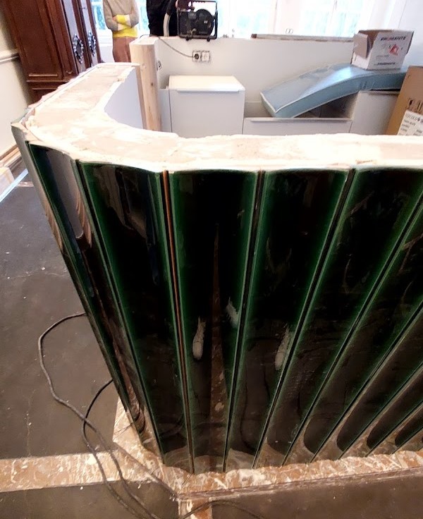
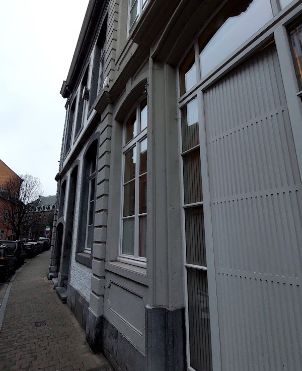
First Concept / Exploration
Concept
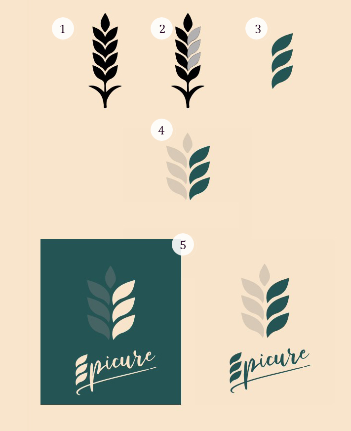
The idea behind the logo was to use a wheat ear or a flower, highlighting three leaves of the ear to form the letter “É” of Epicure.
This approach allowed us to create a logotype that can be used across different applications, with or without the accompanying lettering.
The choice of a cursive typeface conveys the feeling of local craftsmanship. A fragment of the logotype is echoed inside the letter “É” of Epicure, strengthening the visual link.
Colors
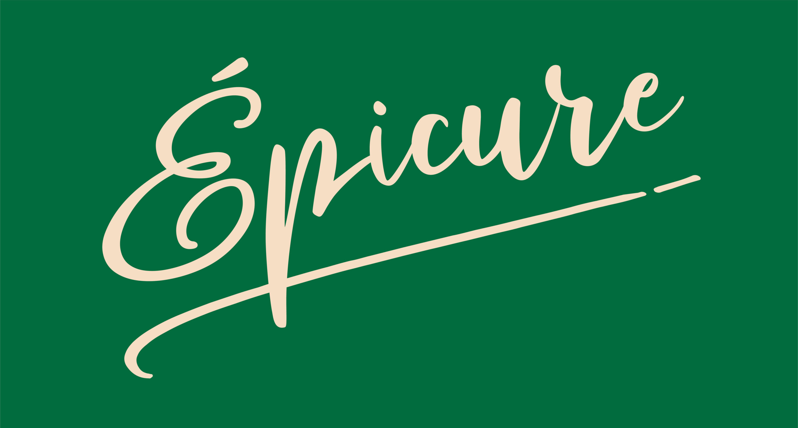
The green was chosen in direct connection with the zellige-style tiles that will cover the bar counter.
As a complementary tone, we selected a shade between off-white and kraft paper.
Together, these colors offer both contrast and warmth, while reflecting a handcrafted and authentic atmosphere.
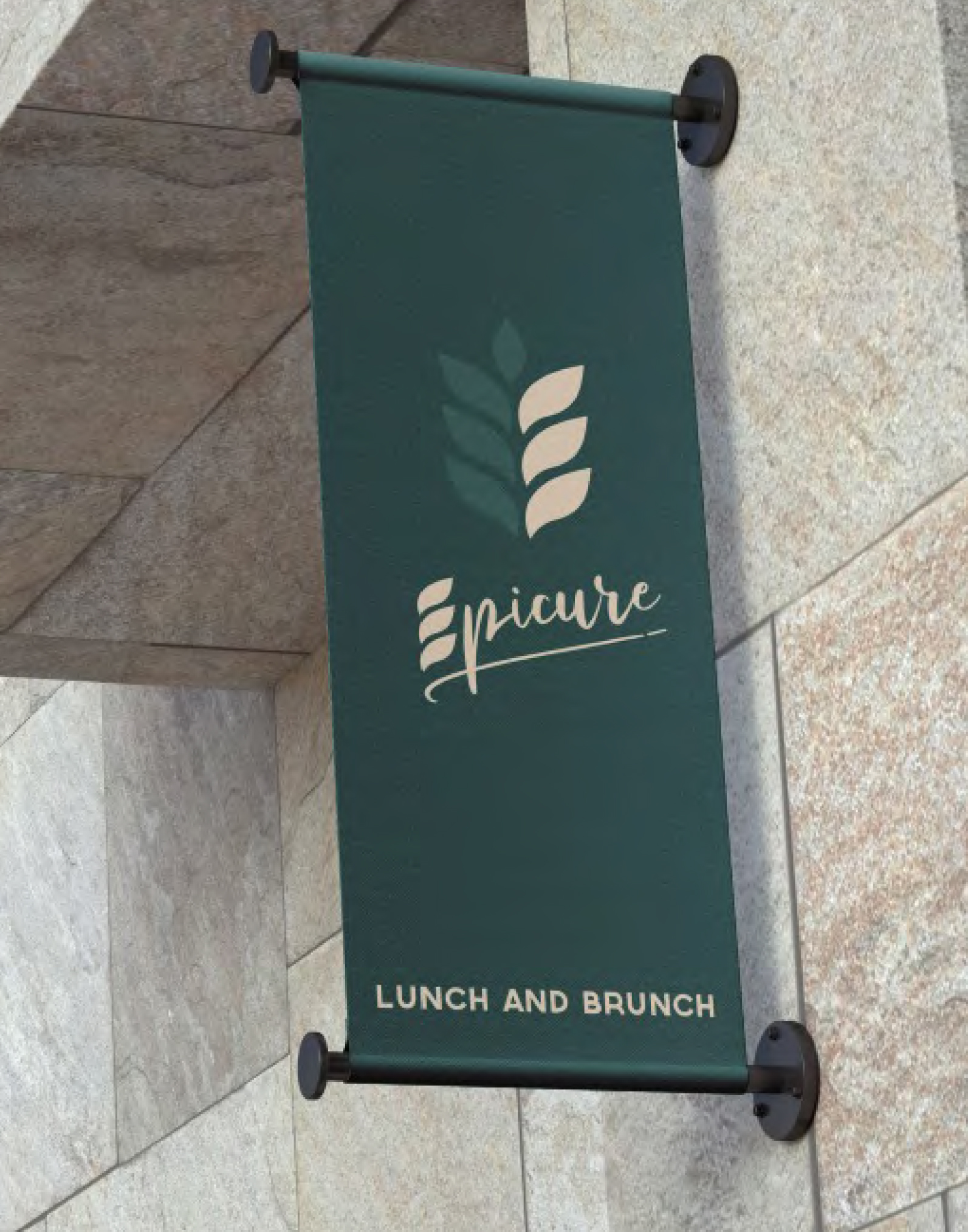
After the Client’s feedback
The finalized identity blends a handwritten logotype with a symbolic emblem built around the letter “É” from their original logo and cereal-inspired leaves. This combination brings together elegance, authenticity, and craftsmanship.
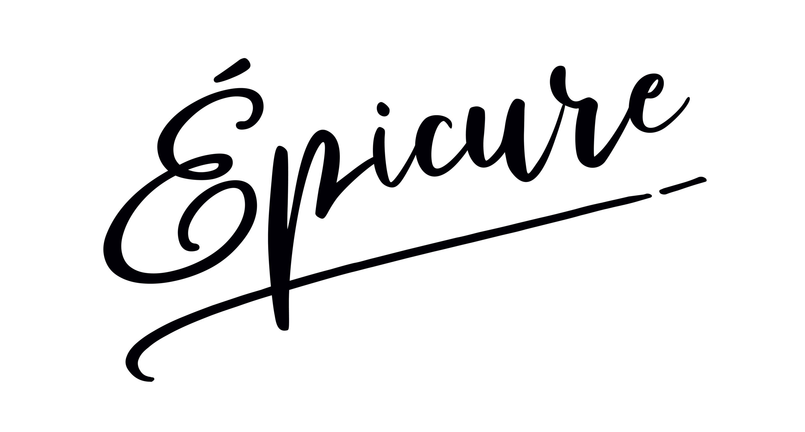
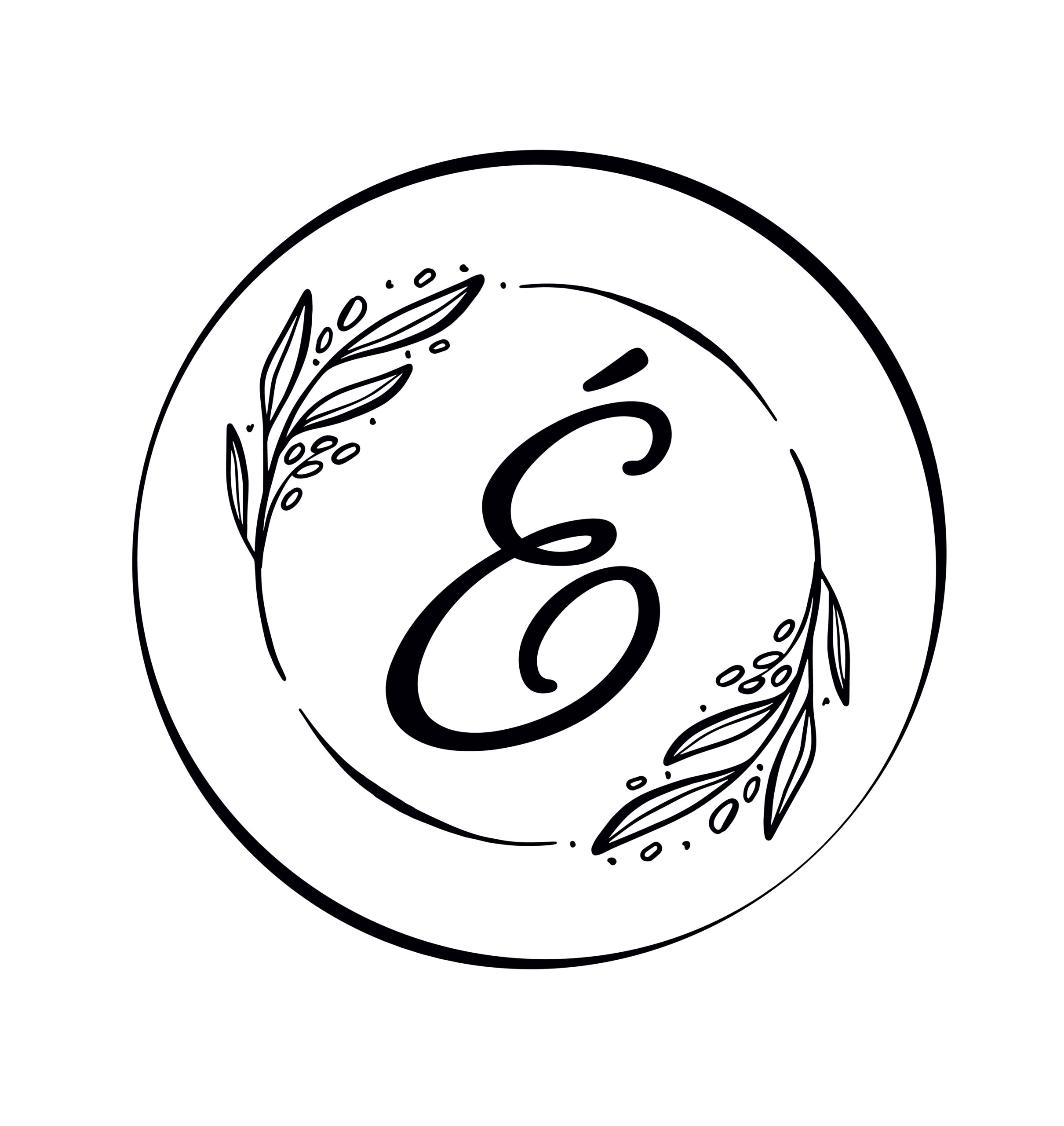
Logotype
Branches of olive were also integrated into the emblem, while the overall circular shape evokes a plate, reinforcing the restaurant context and the culinary dimension of the brand.
Color adjustments
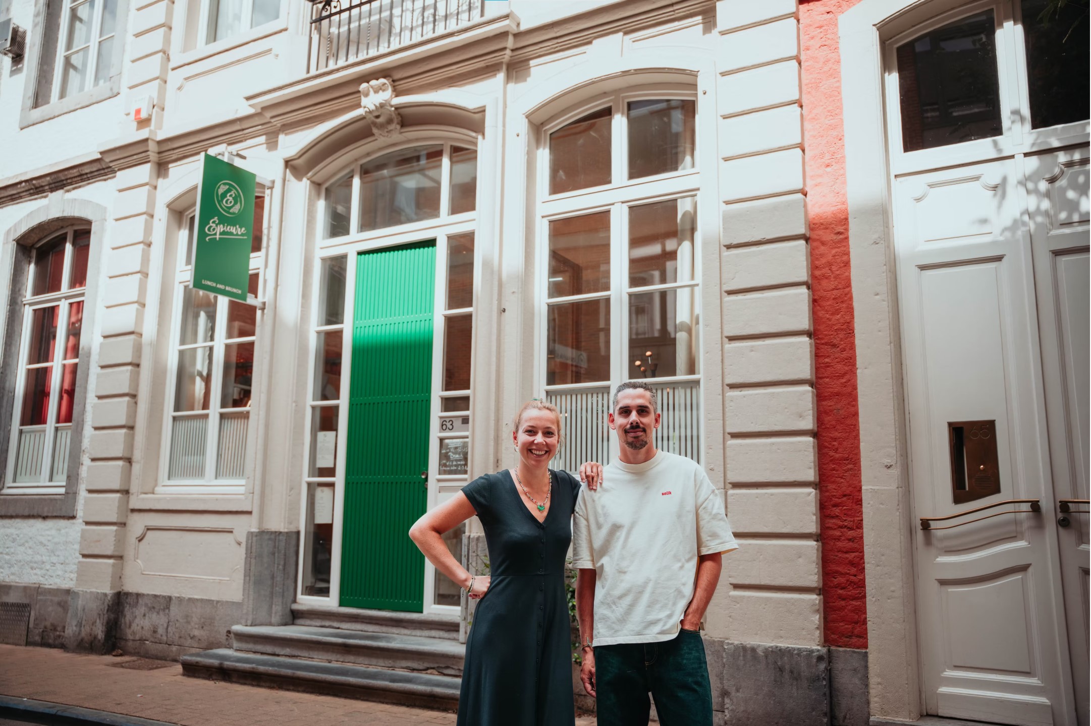
The refined green and kraft palette conveys freshness and authenticity. During the process, the green was carefully adjusted on site with the painter to perfectly match the selected interior color, ensuring full consistency between graphic identity and architectural design.
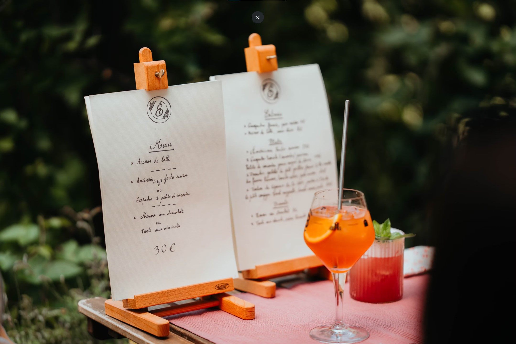
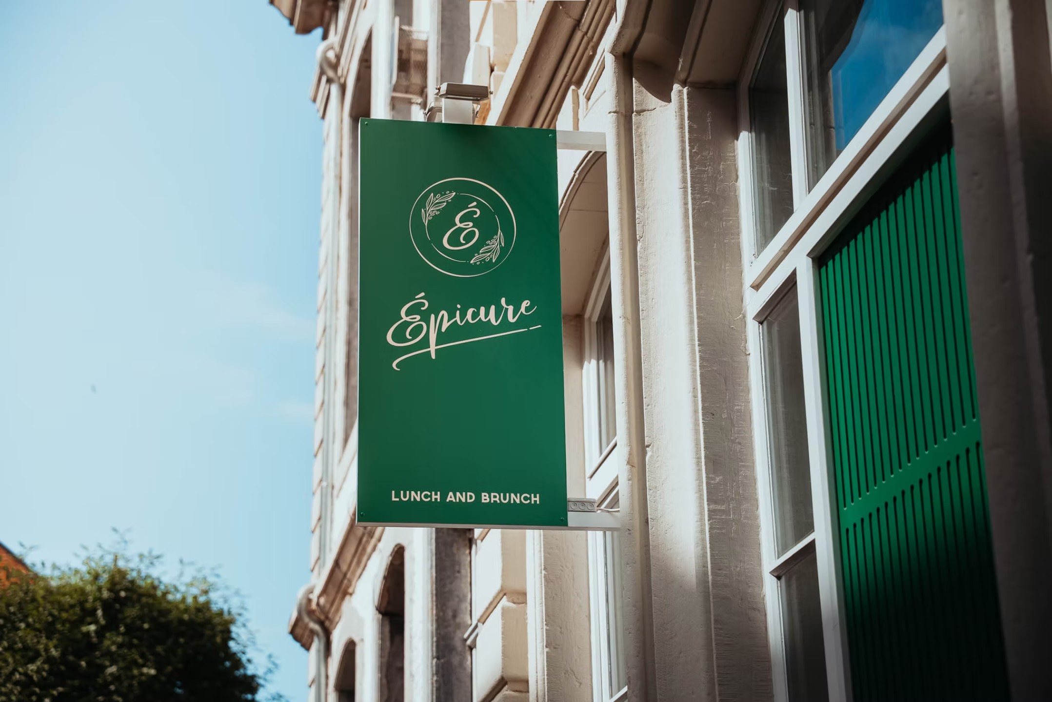
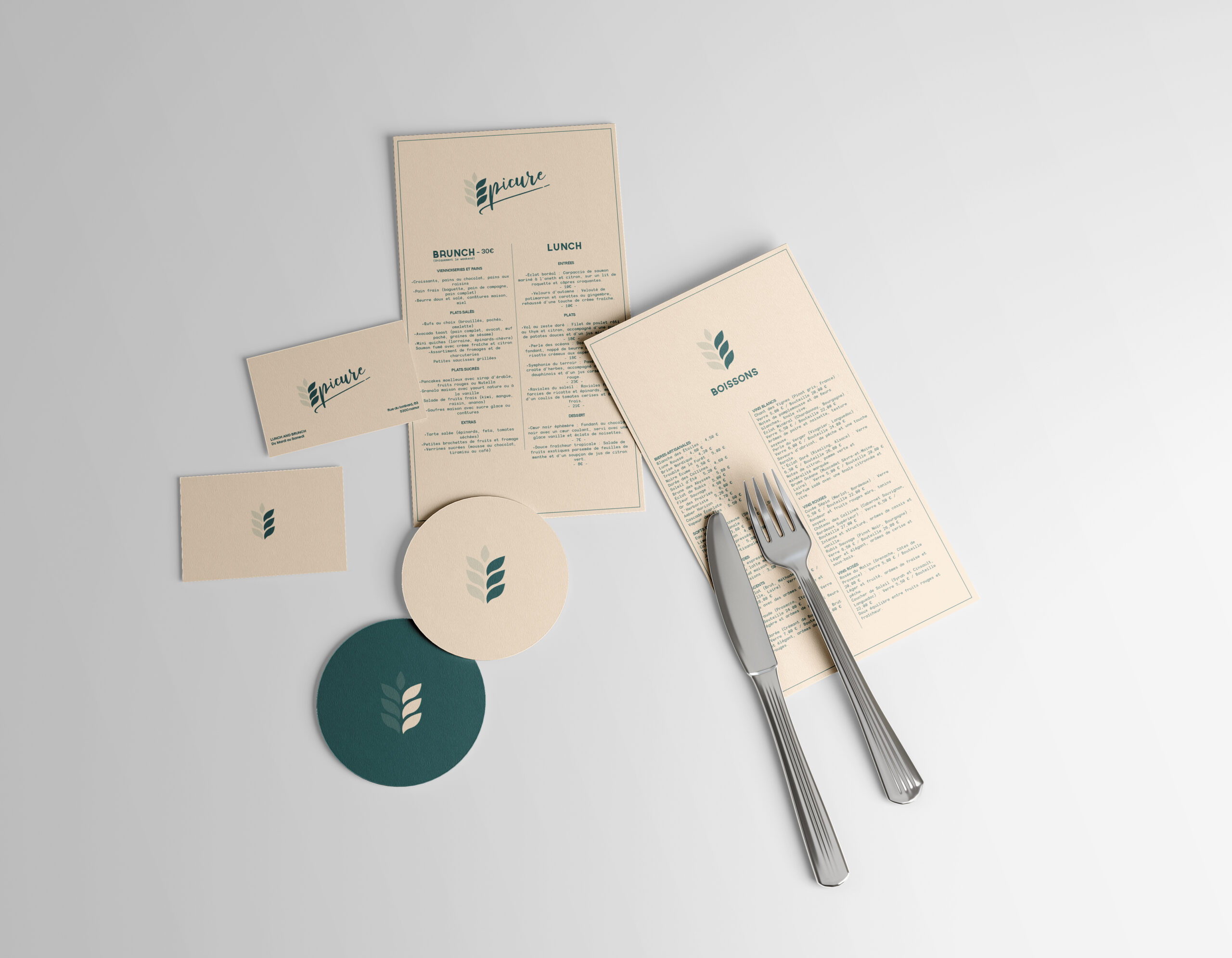
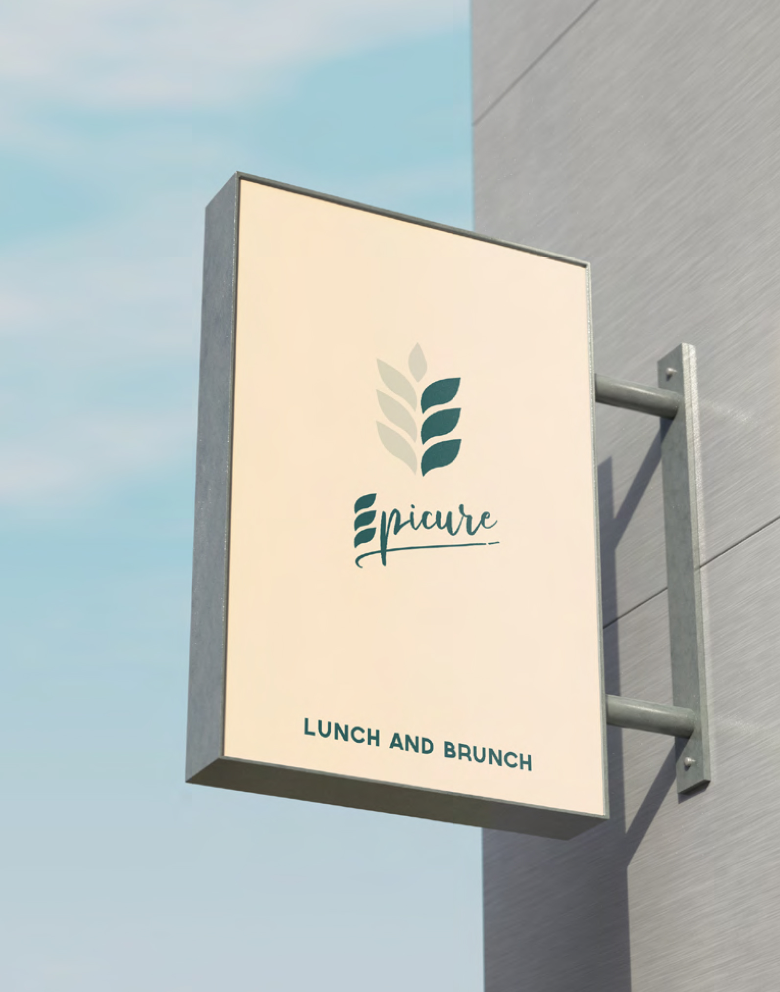
The visual identity was applied across menus, signage, and public-facing materials, crafting a unified and welcoming visual experience.
Thanks for watching and follow them on instagram.


